Magico
“At Magico we aim to sweeten your life with as little as one bite of chocolate. Indulge in our miracle berry infused products and test the limits of flavor.”
This fictional chocolate brand, inspired by the magic of miracle berries, was developed with the goal of offering an innovative chocolate experience. I built the brand from conception to visual identity.
Role:
Designer
What you’ll see:
- Consumer & Product Details
- Logotype Design
- Brand Colors & Typefaces
- Mockup
CONSUMER & PRODUCT PROPOSAL DETAILS:
WHO
Adults curious about flavor, individuals that struggle with distaste for certain flavor profiles.WHY
Mystery flavors are generally recieved well and sell in good numbers. This would be a more adult targeted take that no two people would experience the same way.WHAT
A three layered treat consisting of- miracle berry infused chocolate outer layer
- dark chocolate middle
- flavored gummie center

WHEN
Special events, planned experience.WHERE
In-stores, online, brick & mortar.LOGOTYPE IDEATION:
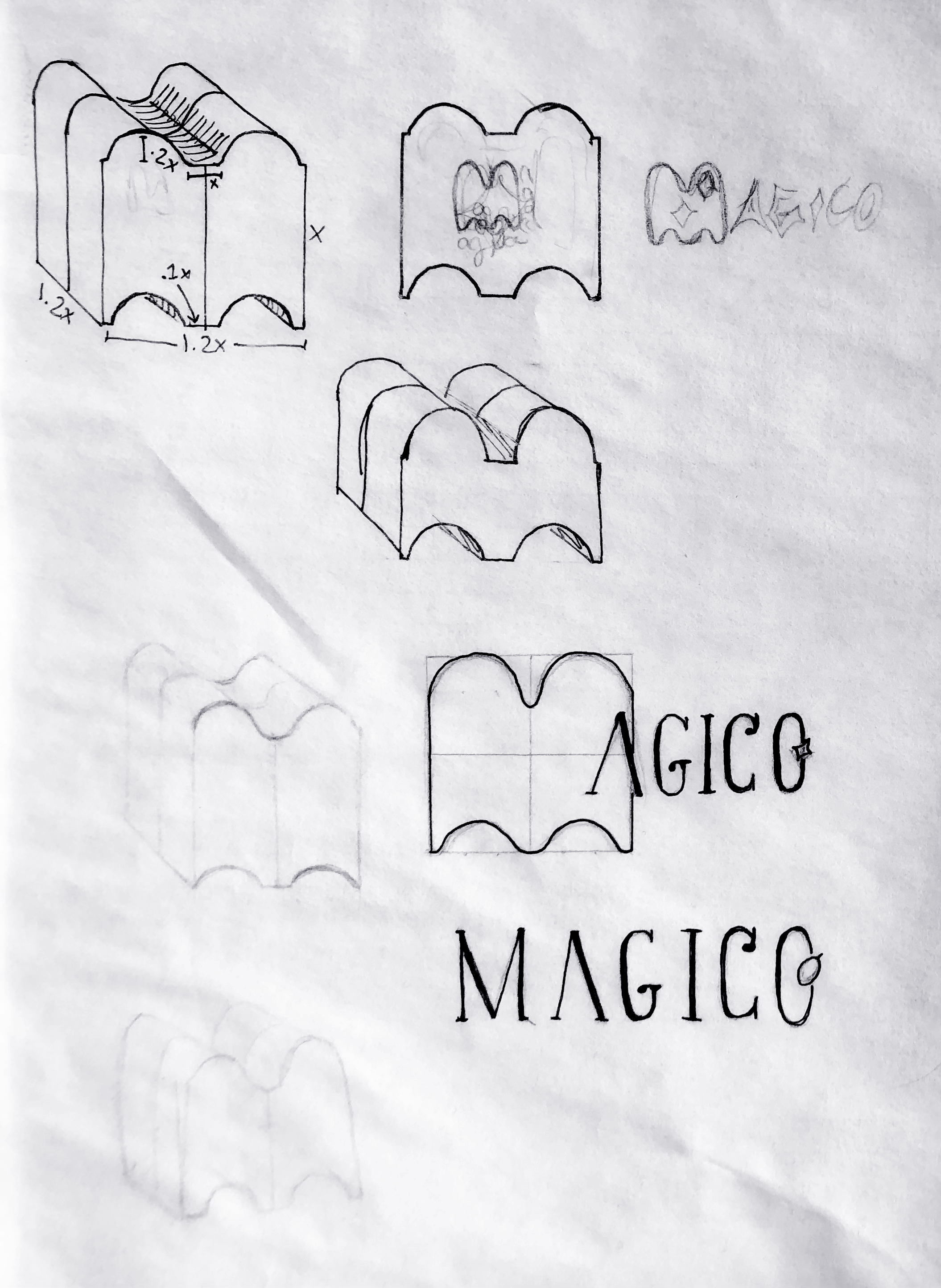
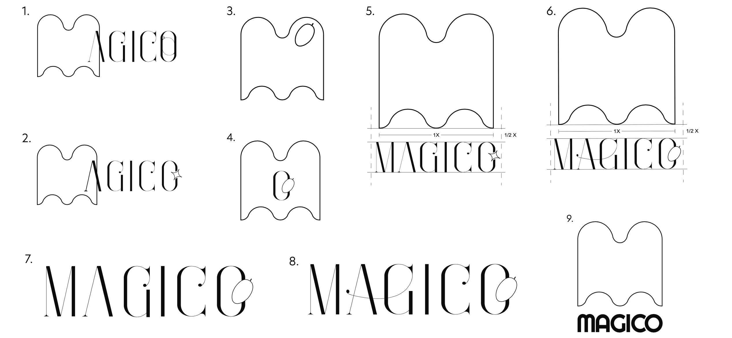
A reflection of the initial modular packaging sketches, the first identifier proposals came from the structural M meant to hold up to 4 chocolate pieces seen on the top left sketch. Eventually my drafts led me to combine the structural and bold M with an elegant serif font.After transitioning these sketches to a digital format it became clear that the serif font (“Enchants”) aptly captures the essense of Magico the best. This also helps the brand more clearly be targeted to adult audiences as it gives it an elegant boost and makes the indulgence even more tempting.


REVISION:
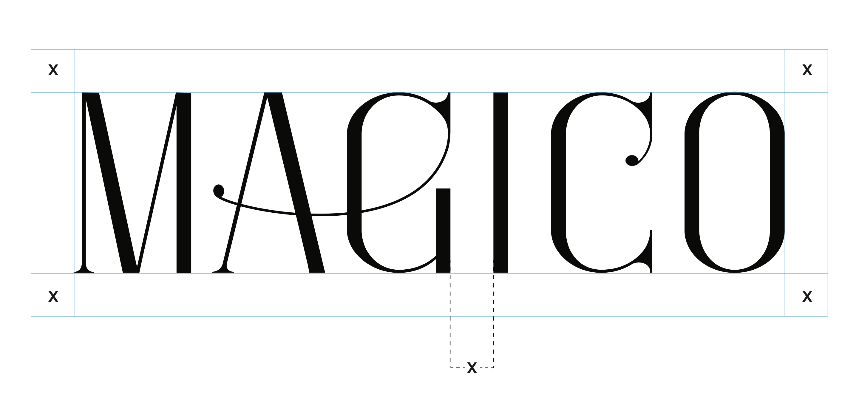
Below is what would ultimately become the final logotype revision with thickened stems, some serif modifications, and the berry imagery removed for better readability


COLORS & TYPEFACES:
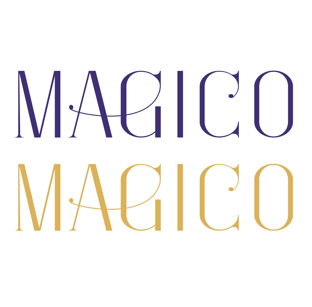
The final color palette used a deep purple and a golden yellow to tie in the playful magic of the brand. The blues are used sparingly, but serve as a cooldowned backdrop for the two rich primary colors.

