Healthcare Samples
Below you will see pieces from three works I’ve done with McCann Health. Though I am not able to share layouts or specific details of the pieces, I’ve shared the challenges, goals, and process that went into each development.
Role:
UX researcher & designer
What you’ll see:
- Disease A education website
- Disease B education microsite
- Product A website
01.DISEASE A EDUCATION WEBSITE:
Problem areas: My team was asked to update a global disease education website. The original domain took users to a landing page where they had to select either the patient or healthcare professional side of the website. A mockup of the initial website set-up is below.Following a period of discovery and analysis research it was concluded this was not an optimal use of the domain. Moving forward the domain would offer disease information to users right away with the healthcare professional side taking the default domain.
AUDIENCE:
Healthcare Professionals and Patients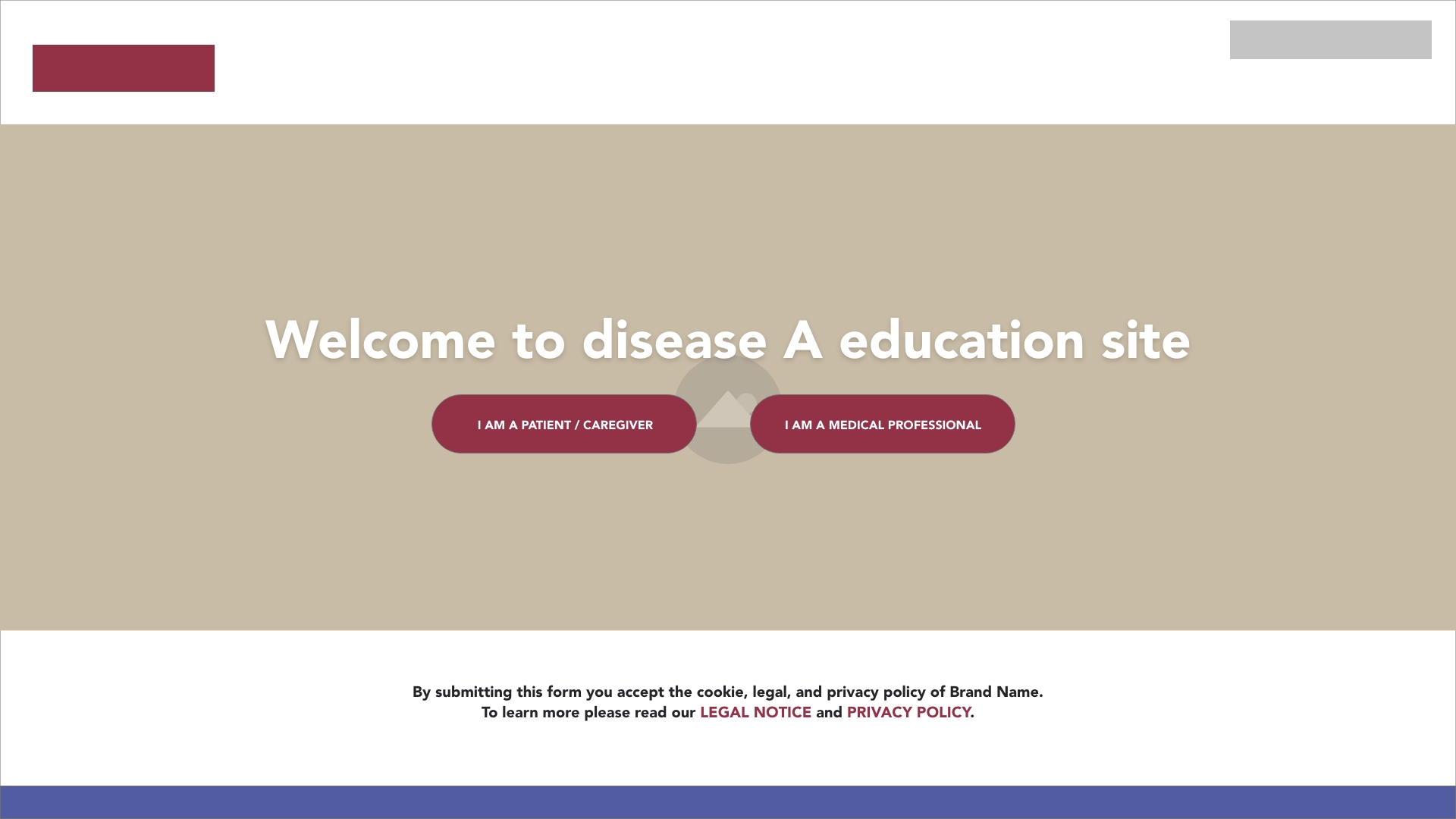
Healthcare Professional (HCP) vs Patient live site set-up
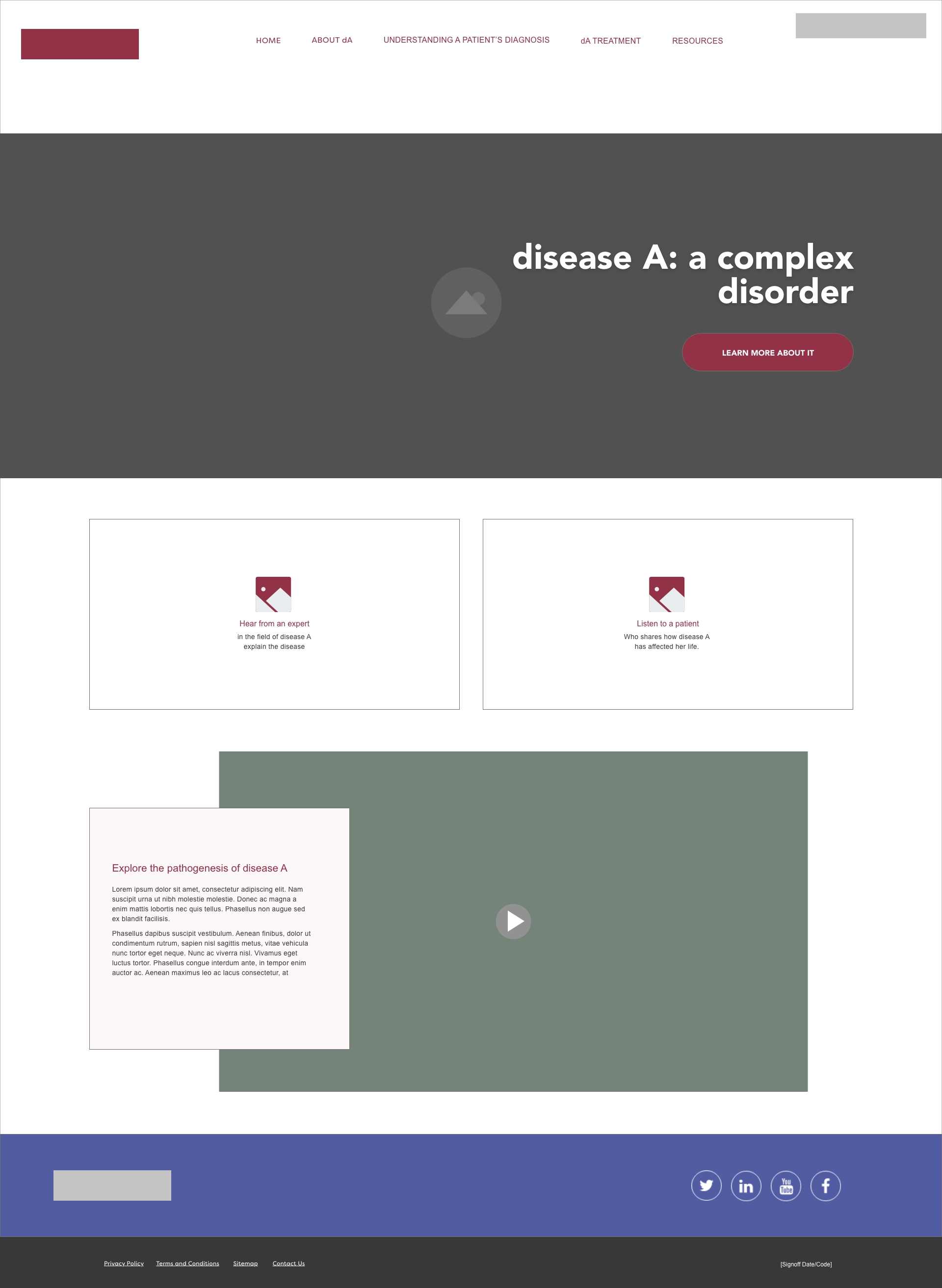
In addition, the content catered to professionals and patients did not differ enough to offer an empathetic educational resource for either audience. For HCPs the content relied heavily on videos with little text and imagery. For patients, the content relied heavily on text and video with little imagery making the content harder to digest.
Below are mockups of the original site. First the HCP homepage followed by an eerily similar patient homepage. The content blocks take up a lot of page real-estate without offering much information.

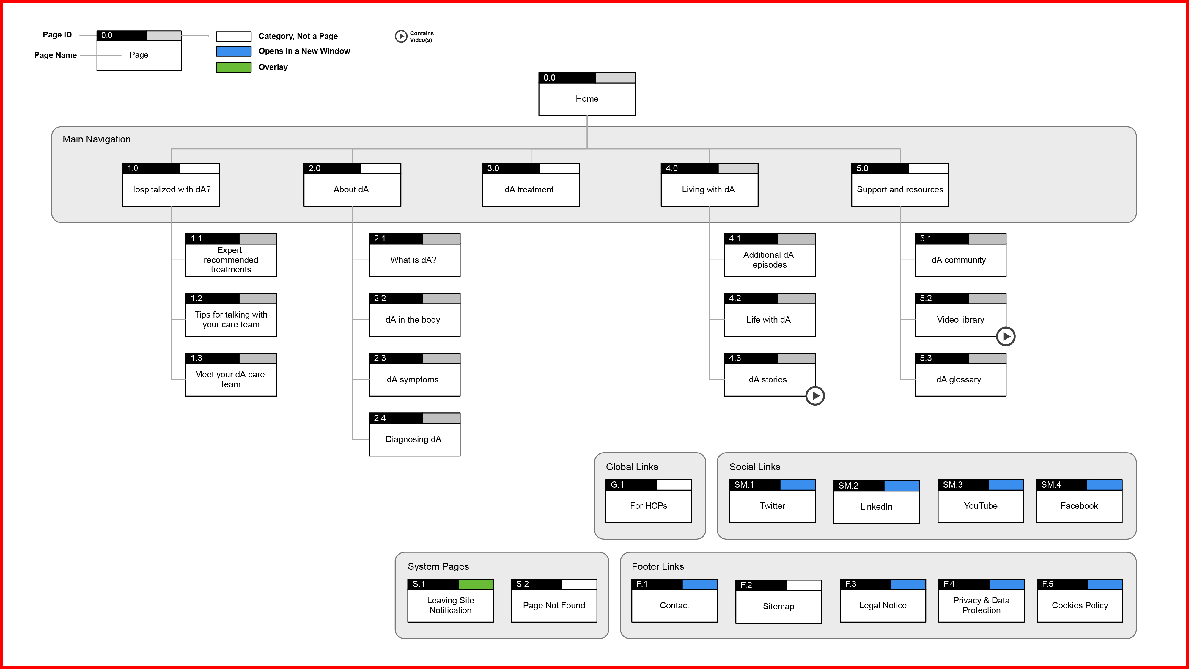
Healchare Professional Sitemap
The content was reassessed and restructured in a way that would best benefit HCPs wanting to learn more about the disease.

Patient Sitemap
Similarly, the content was reassessed and restructured in a way that would best fit the needs of patients and/or caregivers. An important new category was added to the site that offeres critical information under “Hospitalized with dA?“
Initial Homepage Proposal:
As the content continued to evolve, an emergency callout was added to both the HCP and patient side of the website. This became a crucial part of the homepage, and it was important to present the team with a few different options on how this callout may live. Below is one of those options.


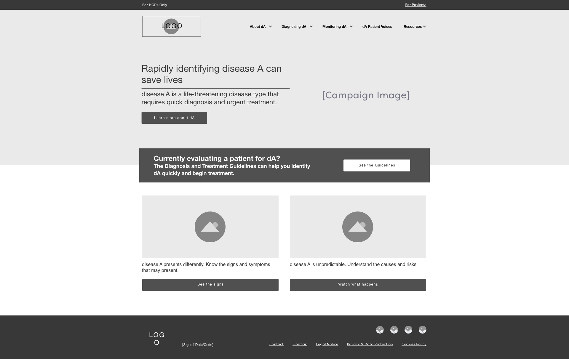
Final HCP Homepage Wireframe
Below is the homepage set-up that was decided would serve users the best. The navigation & hero space take up significantly less real-estate on inital load than the original site, allowing the emergency violator treatment to take center stage. Overall, the content blocks are more appropriately scaled and the language is more direct.

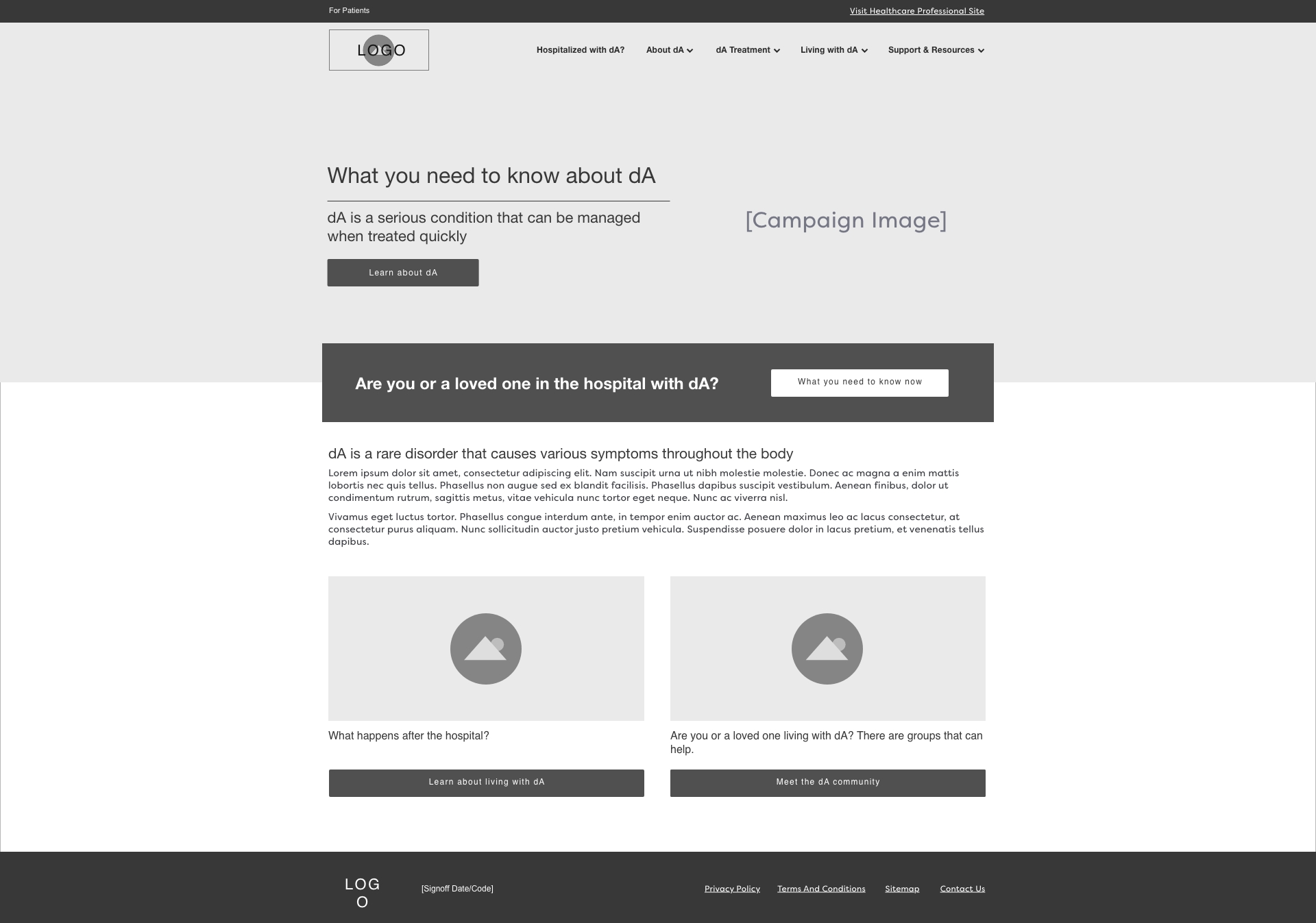
Final Patient Homepage Wireframe
The patient homepage is a reflection of the HCP homepage with the exception of a disease definition content block. This shows the site’s new flexibility to cater to its non-professional audience that may need a formal introduction to the terms related to the disease. There is now a healthy amount of visuals that play a role in content flow throughout the site, allowing the information to be processed more easily.
Throughout the continuation of the project I have been involved in layout development and functionality testing. I am not able to share those on this page.

02. DISEASE B EDUCATION MICROSITE
Problem area: A client asked us to create a one-page, interactive microsite from scratch that educates HCPs on a few related diseases. In the long run, this site is meant to house all of this client’s unbranded content for one of their products. See the sitemap below.AUDIENCE:
Healthcare Professionals
Wireframe
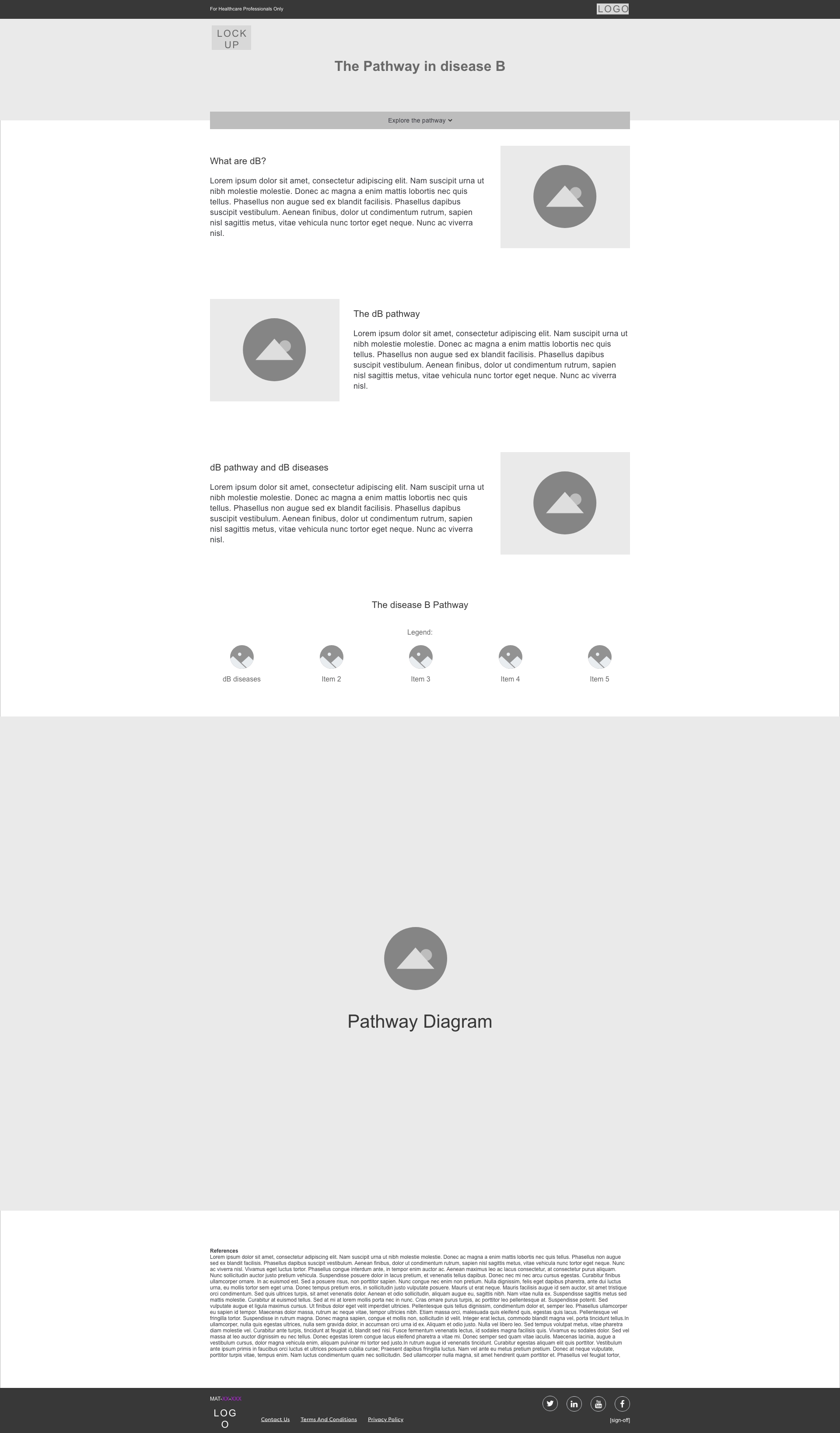
I worked closely with the copy team to decide on the density of this one-page site. Below you can see the Home, or main-page, where it was important for us to provide minimal background information as well as the option to jump straight to the interactive experience upon load.
Having worked on various interactive diagrams in the past (one being for the disease education site above), I knew that legibility was important, so setting up space for a legend was a must.
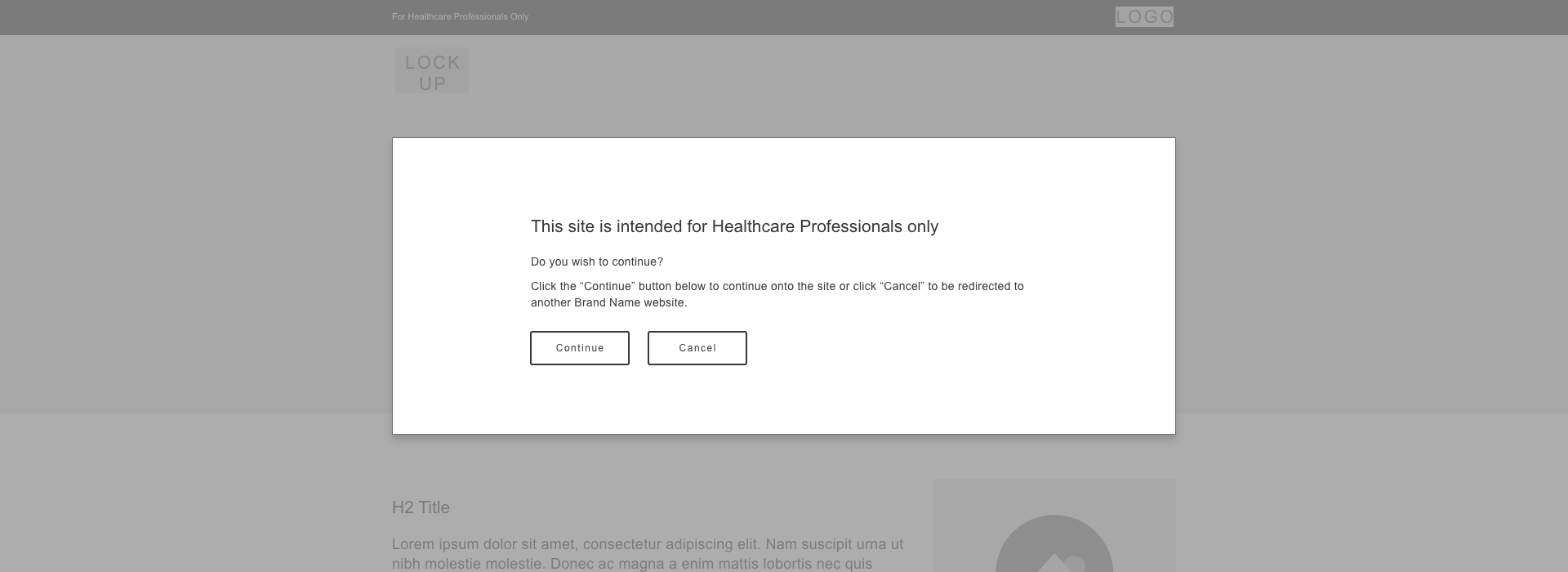
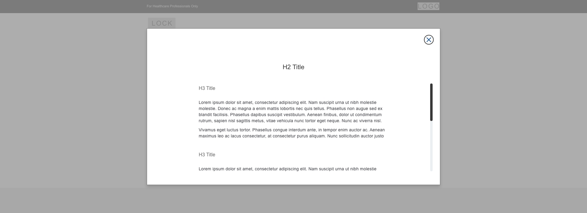
The content within the interactive diagram was designed to live within pop-ups in order to keep the website concise.

03. PRODUCT A WEBSITE:
Problem area: We were asked to update an existing HCP product website as a new campaign gets ready to launch. Our goal is to improve the site’s overall score in regards to usability, SEO, and bounce rate metrics. Following in-depth discovery & analysis research that I’m unfortunately not able to share, the team began restructuring the site to better fit the needs of its HCP audience.Below is the original sitemap. The information that would be of most value to an HCP gets lost under “About product A” and the content is split up into too many sub-pages, each with little content.
AUDIENCE:
Healthcare Professionals
Below is the new proposed sitemap. We bring all of the information that would be most valuable to HCPs directly up to the navigation, rather than under a category. Overall, we’ve reduced the number of pages allowing the site to be more streamlined.
After these initial analytical stages, I helped develop wireframes and proposed opportunities for interactivity throughout the site.
After these initial analytical stages, I helped develop wireframes and proposed opportunities for interactivity throughout the site.
